主要是常用的画图函数
主要是常用的数据分析函数模块
1
2
3
4
5
6
7
import numpy as npimport pandas as pdimport matplotlib.pyplot as pltimport seaborn as snscolor = sns.color_palette() %matplotlib inline
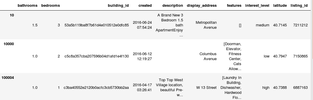
读取数据
1
2
train = pd.read_json("train.json" ) test = pd.read_json("test.json" )
显示前5行
从上可以看到数据类型都有:数值型,类别型,时间特征,文本特征…
查看数据的行数:
1
2
print ("Train Rows: " ,train.shape[0 ])print ("Test Rows: " ,test.shape[0 ])
条形图
利用矩阵条的高度反映数值变量的集中趋势,某一类别下出现个数等等,比如
1
2
3
4
5
6
int_level = train['interest_level' ].value_counts() plt.figure(figsize=(8 ,4 )) sns.barplot(int_level.index,int_level.values,alpha = 0.8 ,color = color[1 ]) plt.ylabel('Number of Occurrences' ,fontsize = 12 ) plt.xlabel('Interest level' ,fontsize =12 ) plt.show()
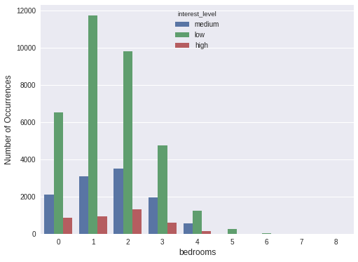
计数图
可将它认为一种应用到分类变量的直方图,也可认为它是用以比较类别间计数差,调用 count 函数的 barplot,比如:
1 2 3 4 5 plt.figure(figsize=(8 ,6 )) sns.countplot(x='bedrooms' , hue='interest_level' , data=train) plt.ylabel('Number of Occurrences' , fontsize=12 ) plt.xlabel('bedrooms' , fontsize=12 ) plt.show()
散点图
可以观察数值变量是否存在异常值,比如
1 2 3 4 5 plt.figure(figsize=(8 ,6 )) plt.scatter(range (train_df.shape[0 ]), np.sort(train_df.price.values)) plt.xlabel('index' , fontsize=12 ) plt.ylabel('price' , fontsize=12 ) plt.show()
可以看到上面存在异常值,需要对异常值进行处理,比如删除或者分箱处理
密度图
针对上面的异常值,我们采取删除处理,然后查看数据的分布情况
1
2
3
4
5
6
ulimit = np.percentile(train_df.price.values, 99 ) train_df['price' ].ix[train_df['price' ]>ulimit] = ulimit plt.figure(figsize=(8 ,6 )) sns.distplot(train_df.price.values, bins=50 , kde=True ) plt.xlabel('price' , fontsize=12 ) plt.show()
经纬度-热力图
1
2
3
4
5
6
7
8
9
10
from mpl_toolkits.basemap import Basemapfrom matplotlib import cmwest, south, east, north = -74.02 , 40.64 , -73.85 , 40.86 fig = plt.figure(figsize=(14 ,10 )) ax = fig.add_subplot(111 ) m = Basemap(projection='merc' , llcrnrlat=south, urcrnrlat=north, llcrnrlon=west, urcrnrlon=east, lat_ts=south, resolution='i' ) x, y = m(train_df['longitude' ].values, train_df['latitude' ].values) m.hexbin(x, y, gridsize=200 , bins='log' , cmap=cm.YlOrRd_r);
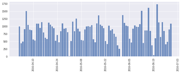
时间序列图-统计情况
查看trian数据集
1 2 3 4 5 6 7 8 9 train_df["created" ] = pd.to_datetime(train_df["created" ]) train_df["date_created" ] = train_df["created" ].dt.date cnt_srs = train_df['date_created' ].value_counts() plt.figure(figsize=(12 ,4 )) ax = plt.subplot(111 ) ax.bar(cnt_srs.index, cnt_srs.values, alpha=0.8 ) ax.xaxis_date() plt.xticks(rotation='vertical' ) plt.show()
查看test数据集
1 2 3 4 5 6 7 8 9 test_df["created" ] = pd.to_datetime(test_df["created" ]) test_df["date_created" ] = test_df["created" ].dt.date cnt_srs = test_df['date_created' ].value_counts() plt.figure(figsize=(12 ,4 )) ax = plt.subplot(111 ) ax.bar(cnt_srs.index, cnt_srs.values, alpha=0.8 ) ax.xaxis_date() plt.xticks(rotation='vertical' ) plt.show()
发现train和test数据集很相似